Measures

Analytic insights that are actionable, timely, and in context

Measures is the part of Hatch Data where insight turns into work. When the platform finds waste in a building, like equipment running through a weekend, it opens a measure: a recommendation with a cost, an owner, and a status. I redesigned how measures are worked and closed, so the record shows what really happened and what it saved.

An abstract illustration: three soft rounded bars, the middle one mint green with a check mark at its end, and a short trail of dots leading in.
My Role
Product Designer, Hatch Data
Research synthesis, journey mapping, flows, and UI
Context
2021
Partnered with product, engineering, and the advisory team

The problem

Half of the automated measures marked as implemented hadn’t been.

A preliminary analysis of measures resolved by July 2021 showed that 50% of automated measures were being incorrectly marked as implemented.

Status changes didn’t capture the reasoning behind them, and there was no way to verify the impact of the work from inside the workflow. The savings we reported were only as good as a status dropdown.

50%
of automated measures resolved by July 2021 were incorrectly marked as implemented

Goals

  1. 01

    Close measures correctly

    Reduce the number of measures resolved with the wrong status.

  2. 02

    Show the work

    Make what was done on a measure visible before it is closed.

  3. 03

    Verify the impact

    Prove what the work achieved at the moment the measure is closed.

What we heard

Interviews with customers and internal stakeholders showed that people wanted specific changes to the Measures workflow. Annotations, conversations with teammates, and measurement and verification (M&V) all happened outside the product, so stakeholders drifted out of step.

Mixpanel told the same story. About 45% of the time, users left a comment after closing a measure. They had more to say than the status allowed. But comments were free-form, so our advisory team sorted them by hand to work out what had actually been implemented.

~45%
of closed measures got a comment after closing, which the advisory team sorted by hand

Finding where it breaks

We plotted every pain point from research onto the lifecycle of a measure, from the moment it's created to the feedback afterward. One stage stood out: closing a measure was where the work and the record came apart.

  1. Measure creation

    “My feedback doesn’t influence future measures”

  2. Measure notification

    “I’m not always aware of which measures remain open and need work”

  3. Investigate and prioritize

    “It’s hard to tell whether a measure is actionable from the information given”

  4. Working on a measure

    “It’s hard to talk with others about a measure and where it is in the workflow”

  5. Closing a measureOur focus

    “My work isn’t accurately reflected when I close a measure”

  6. M&V and reporting

    “The impact of my work isn’t represented or verified”

  7. Measure feedback

    “I don’t have an easy way to update measure assumptions”

Choosing what to build

Within that stage we ranked every request. The top two, revising measure statuses and adding reasons for closing, went straight at the 50% problem, so they became the core of the project.

  1. Revise measure statuses and actionsIncluding descriptions for each status (In scope)30
  2. Closed reasons (In scope)27
  3. Schedule updates within a measure27
  4. Auto implementation verification on close24
  5. Measure logic feedback mechanism19
  6. Measure type enablements18
  7. Measure expiration15
  8. Measure parameter configuration15
  9. Self-serve enable and disable10
  10. Schedule change prompts a status change9
  11. Custom actions and statuses2

A day in the field

Tom is a building engineer. Works assigned tasks in the field and reports progress to the chief engineer. Following their day showed where measures fit into the work, and where the product left them to fill gaps with email and memory.

  1. 01Reviews assigned tasks and the preventive maintenance schedule in the work order system

    • Measures
    • Notifications
    • Work order integrations

    OpportunityDeeper integration with work order systems

  2. 02Investigates the task in the field or through the building automation system

    • Measures
    • Explorer
    • Mobile

    OpportunityMobile tools to review a measure, validate the observed issue, and share progress

  3. 03Resolves the task and completes maintenance, tracking time and steps taken

    • Measures
    • Admin

    OpportunityMobile tools to work in the field with up-to-date information and track status

  4. 04Reports progress and work to the chief engineer

    • Measures
    • Reporting
    • Email

    OpportunityOne place to track actions taken, like notes, so they tie back to impact

The brief

Give the people doing the work a transparent, structured way to show it, so every closed measure reflects what really happened and what it saved.

The whole lifecycle

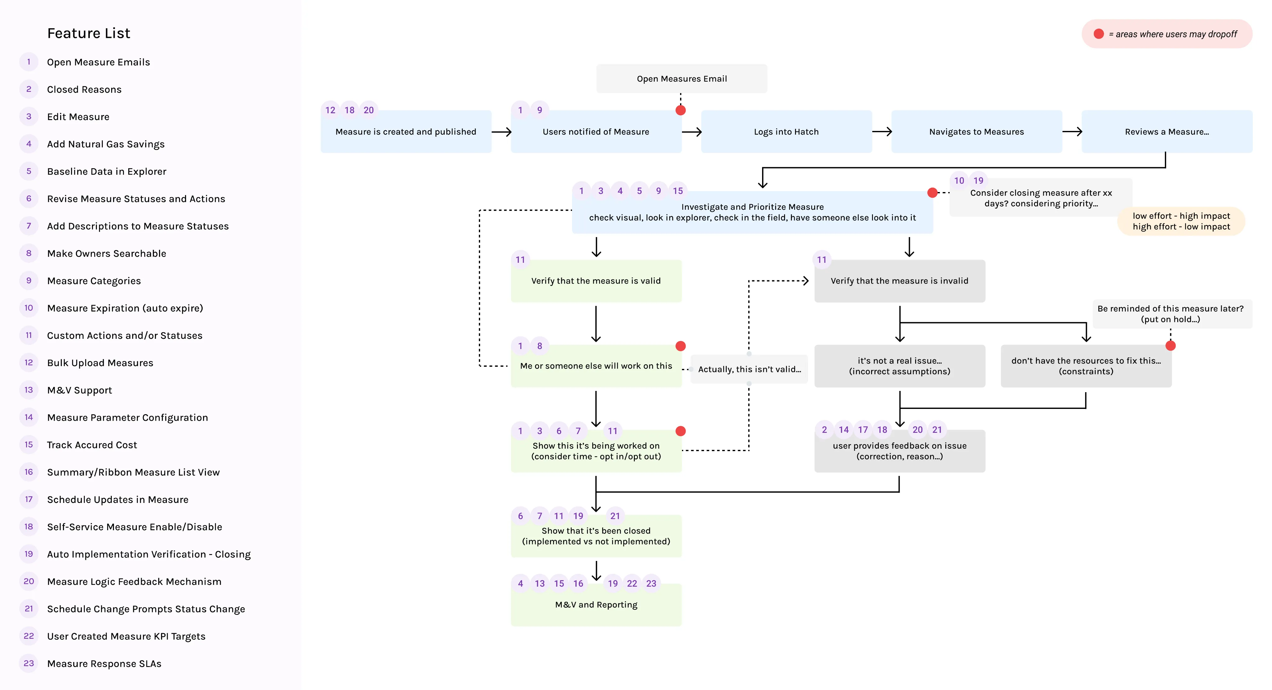
The user flow maps a measure from creation to M&V, with all 23 candidate features placed where they would help. The red markers show where users were likely to drop off, and the closing steps are where most features cluster.

The measure lifecycle flow: created, notified, investigated, verified as valid or invalid, worked on, closed as implemented or not implemented, then M&V and reporting. Numbered badges tie each step to a 23-item feature list, and red dots mark likely drop-off points.
The measure lifecycle, with the feature list mapped onto it and drop-off points in red

Four design decisions

Split one status into three questions

Closing a measure now asks for a status, a resolution (implemented or not implemented), and a reason. Each option comes with a description, so “closed” no longer has to mean “done”.

This took on the two most-requested changes for closing a measure, and it turned the reasoning hidden in free-form comments into data we could analyze.

The tradeoffMore clicks at the moment someone wants to be finished. We kept the fields short and the defaults sensible so the extra step felt like a confirmation, not a form.
Let people show their work

Every measure keeps an activity log of status changes, comments, and uploads, with who did each one and when.

Task management needs transparency. The log answers the chief engineer’s question, “what happened here?”, without a meeting or an email thread.

The tradeoffA busy measure has a long log. It leads with the latest events and puts the full history behind “View all”.

Keep the evidence with the measure

Teams can attach supporting documents, such as an M&V report, straight to the measure. The proof lives next to the claim instead of in someone’s inbox.

The tradeoffAttachments are only as good as what people upload. They support verification, but they don’t replace it.

Put the impact in context

Each measure leads with its avoidable impact: cost, emissions, electricity, and gas. Beside the observed issue, a chart compares usage before and after implementation.

Whoever closes the measure can see whether the work moved the line, right where they make the call.

The tradeoffA chart can’t verify every measure on its own. Weather, occupancy, and data gaps all muddy the comparison, so it informs the resolution rather than deciding it.

The product

A measure's whole life on one page, a portfolio view to manage them all, and a list that fits in a pocket.

Measure detail

Everything needed to close a measure honestly, on one screen.

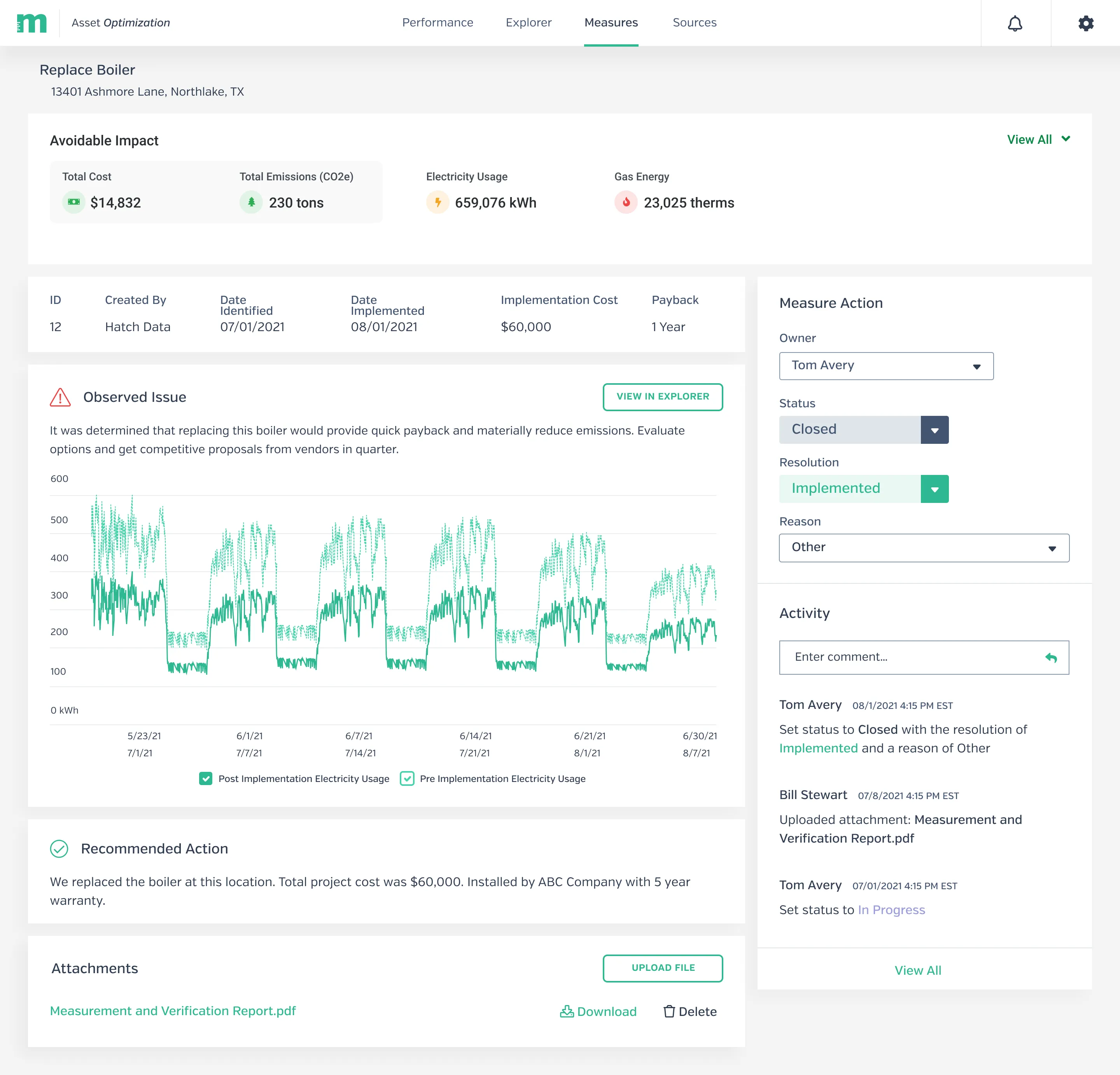
A Replace Boiler measure in Hatch Data. An avoidable impact summary sits above the observed issue, with a chart comparing pre- and post-implementation electricity usage. Below are the recommended action and an attachments list. A side panel sets the owner, status, resolution, and reason, above an activity log.
  1. High-level metrics show the impact of each measure: the emissions and usage avoided.
  2. A transparent, intuitive workflow drives action, so efforts to resolve an issue are clearly reflected.
  3. An activity log shows what was done on a measure, by whom, and when.
  4. Users upload supporting evidence straight to the measure, so documentation lives in one place.

All measures

The portfolio view: what is open, who owns it, and what it is worth.

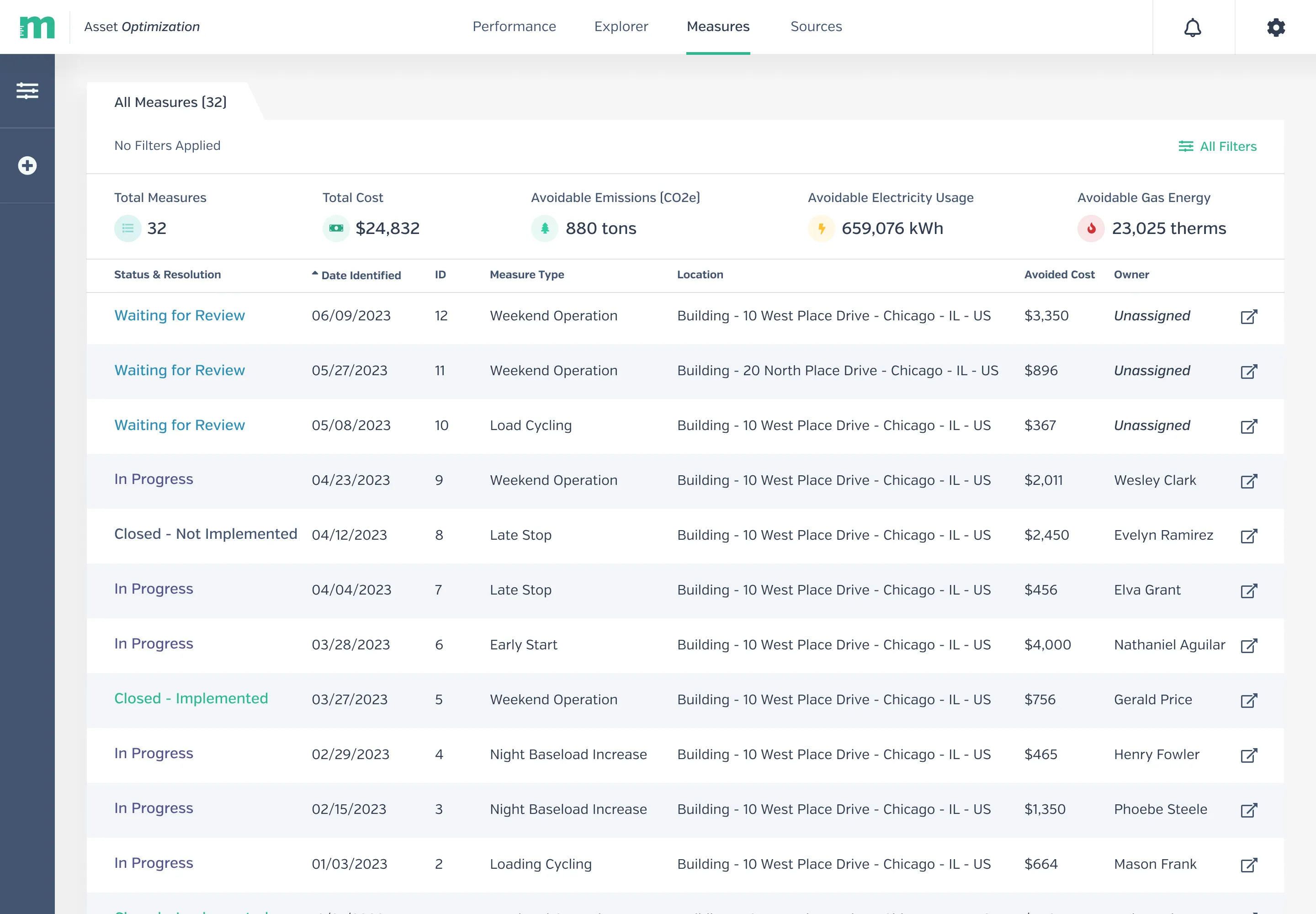
The All Measures table in Hatch Data. A summary row shows total measures, total cost, avoidable emissions, electricity, and gas. Below it, each row lists a measure’s status and resolution, date identified, ID, type, location, avoided cost, and owner.
  1. Totals across every measure: cost, emissions, electricity, and gas that could be avoided.
  2. Status and resolution lead each row, color-coded so new and implemented measures stand out.
  3. Unassigned measures are called out, so nothing sits without someone responsible.

Measures on mobile

For the engineer in the field, where the work actually happens.

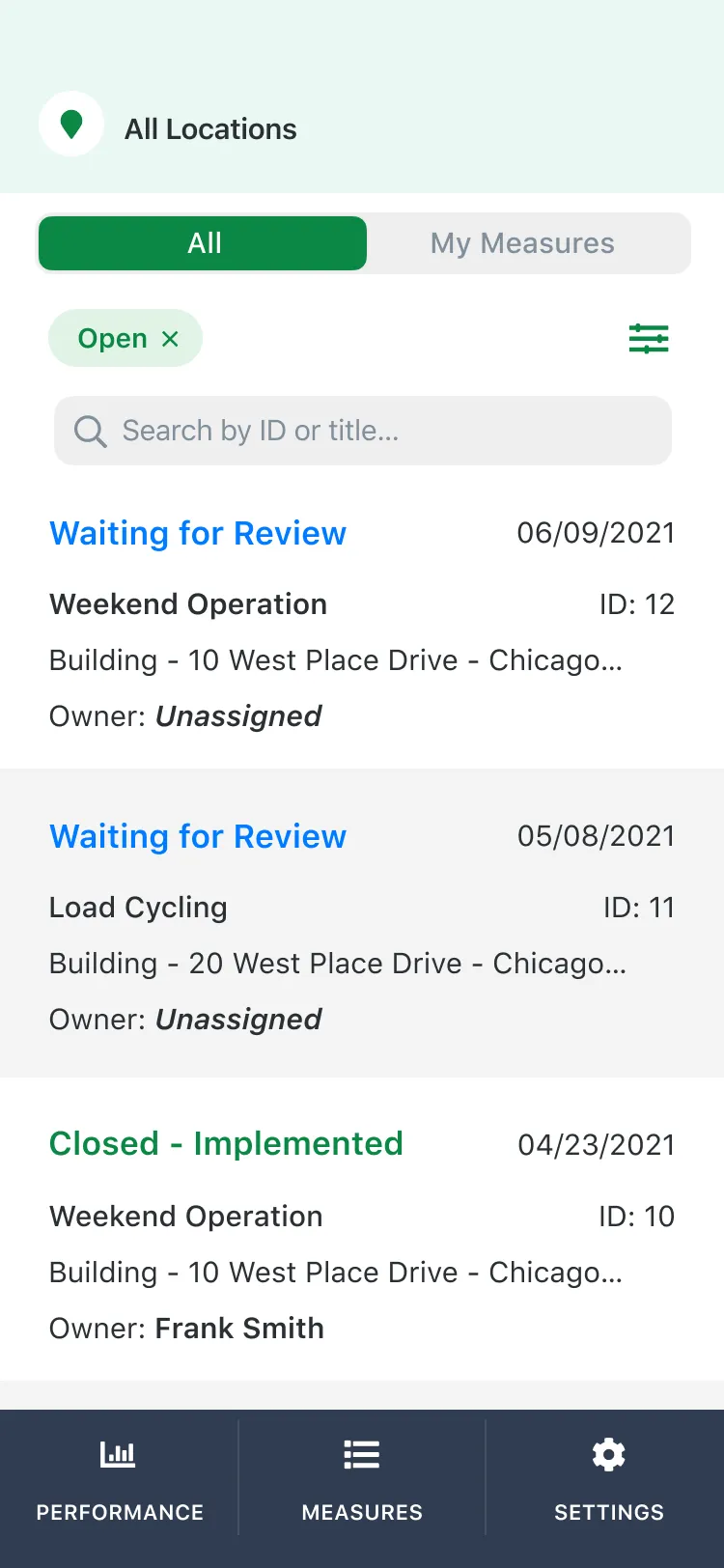
The Measures list on a phone. A location picker sits above an All and My Measures toggle, an Open filter chip, and a search field. Each card shows a status, date, measure type, ID, building, and owner.
  1. “My Measures” filters the list down to the work assigned to you.
  2. Find a measure by ID or title while standing in front of the equipment.
  3. Status comes first on every card, matching the desktop table.

Where it landed

Before50%of automated measures marked implemented in error

Six months after release73%fewer improperly resolved measures in the first six months after release

Takeaways

  • Map feedback onto the journey. There are always more ideas than capacity. Organizing feedback alongside the user’s journey shows which ideas would have the most impact.
  • Task management demands transparency. Let people show their work.
  • B2B users bring B2C expectations. People expect the same polish at work as in the apps they use every day. Patterns from outside enterprise software are worth borrowing.